FREE DESIGNS AND ESTIMATES

4 Incredibly Functional Compact Kitchen Islands

Article by: Mitchell Parker 
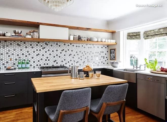
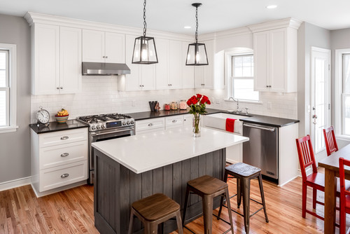
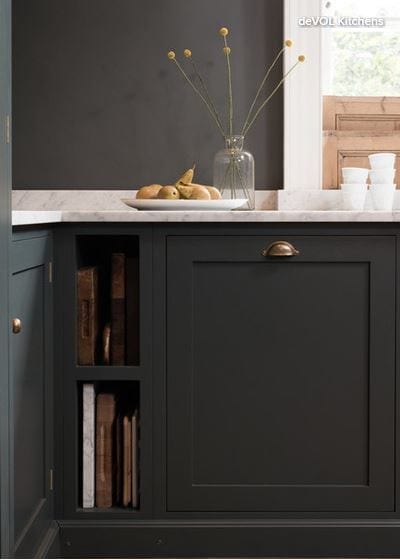
1. Little Black Box

Designer: Frankie Castro of Square Footage 
Location: Ajax, Ontario
Size: 160 square feet (15 square meters); 16 by 10 feet

Homeowners’ request. Bring a 120-year-old kitchen into the 21st century while honoring original details like the cove ceiling, wood flooring, chandelier and molding details. 

Island. 2 by 4 feet, painted black, with a wood top and stainless steel shelves. “It married all the features in this kitchen together,” says designer Frankie Castro, who gained ideas and inspiration by browsing photos on Houzz along with her clients. 


4_Functional_Compact_Kitchens_2.JPG

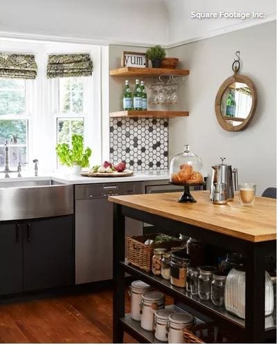
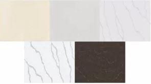
Other special features. Backsplash of white and gray hexagonal mosaic tile. Reclaimed-wood open shelves. Black base cabinets. Quartz countertops. 

Designer secret. “The trick is to keep the vintage feeling and details,” Castro says. “In this kitchen we only went up to the molding line, which featured the cove ceiling prominently. We also kept with the plaster walls and were very careful when cutting or replacing the walls.”

Wall paint: Distant Gray, Benjamin Moore

2. Slim Style

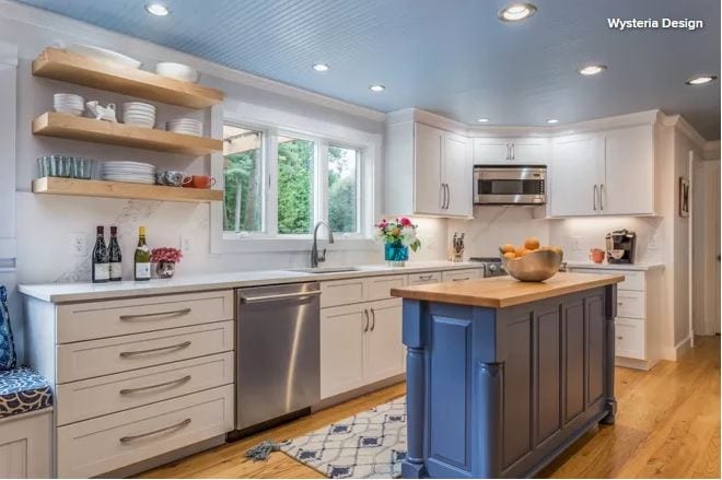
Designer: Becky Corringham of Wysteria Design
Location: Stratham, New Hampshire
Size: 220 square feet (20 square meters); 11 by 20 feet

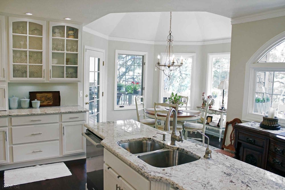
Homeowners’ request. Remove and replace existing dark cherry cabinets, black countertops and a black painted island. The owners found designer Becky Corringham through Houzz’s directory, and they used the site to collaborate on an ideabook of inspirational photos, through which they also bought products like the floating maple shelves and chandelier

Island. 5 feet, 2 inches by 1½ feet with a maple wood base painted blue (Denim by Sherwin-Williams) and a solid butcher-block top. “The homeowners use their island for storing large items like their crockpot, blender, coffee grinder and indoor grill,” Corringham says. “The drawers of the island are used for small miscellaneous utilitarian items, such as pens, paper, scissors and tools.”

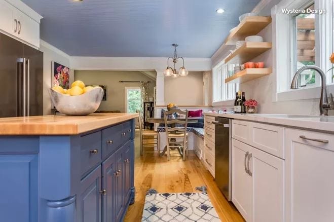
“In the design phase of this project we thought about adding a peninsula instead of an island, because the space in that area is very narrow. The width of the kitchen is about 9½ feet, and the traffic flows past the island leading into the first-floor half bath and laundry room, so we didn’t want to impede the walk space too much. We really liked the idea of keeping the custom bench seating, so that is what ultimately determined the need for an island over a peninsula.”

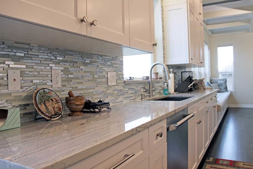
Other special features. Quartz perimeter countertops and backsplash with a Calacatta marble look. Light blue ceiling (Honest Blue by Sherwin-Williams).

3. Sweet Station

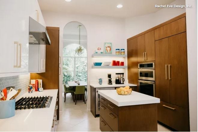
Designer: Rachel Eve Logue of Rachel Eve Design
Location: Palm Beach Gardens, Florida
Size: 140 square feet (13 square meters); 14 by 10 feet

Homeowners’ request. Update a basic, traditional kitchen to reflect a more midcentury modern style within the existing footprint. 

Island. 2 by 4 feet with a rift-cut oak veneer base and 2-inch-thick white quartz countertop. “We made the countertop on the island thicker than the perimeter to give the island more emphasis so it didn’t look so puny,” designer Rachel Eve Logue says. The island has two small top drawers and two deep bottom drawers — plenty of space to store utensils for baking, which the homeowners love to do. 

A 2-by-2-½-foot island existed in the same space before, but because the floor tile didn’t go underneath it, and because the homeowners didn’t want to hassle with replacing the flooring, they decided to keep an island in that spot and increase its size. 

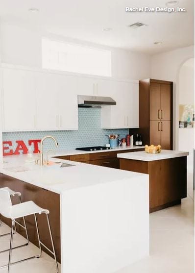
Other special features. Aqua hexagonal tile backsplash and aqua floating shelves. Peninsula with white quartz waterfall-edge detail. Paneled refrigerator and tall pantry. The homeowners had originally thought they wanted all-white cabinets, but when Logue looked through their Houzz ideabook of inspiration photos they had gathered, she noticed that they had saved a lot of kitchens with dark base cabinets and white upper cabinets. She suggested they go that route and include white countertops, to lighten the kitchen but still have that dark wood, midcentury modern vibe. 

Designer secret. The previous backsplash was composed of glass blocks that matched the transom above the range. The glass let in light, but the view to the neighbors’ hedge wasn’t something the owners wanted to hang on to. To get a stylish backsplash, Logue drywalled directly over the glass blocks (they are still visible from the exterior) and covered the drywall with the statement tile. “If we had left the blocks, we just wouldn’t have gotten the same impact in this kitchen,” she says. 
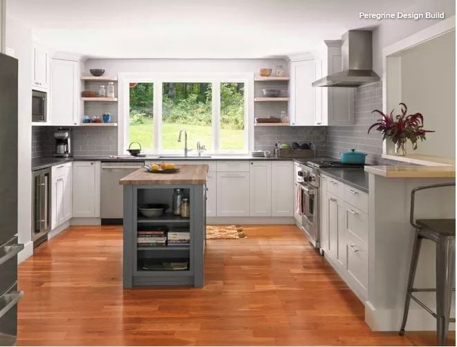

4_Functional_Compact_Kitchens_7.JPG

4. Neat and Narrow

Designer: Cliff Deetjen of Peregrine Design Build
Location: Richmond, Vermont
Size: 250 square feet (23 square meters)

Homeowners’ request. A more light-filled kitchen with new custom cabinets and a better connection to the surrounding areas. 

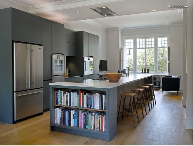
Island. About 2 by 5 feet with a hard maple countertop and painted gray base (Smoke Gray by Benjamin Moore), a color choice that designer Cliff Deetjen says is smart for an active family. “The clients were intent on repurposing their rolling butcher-block island,” Deetjen says. “We convinced them that it was worth the investment to have a custom island built. Not only was it aesthetically appealing, it also offered them additional storage and an efficient place to organize their day. Cookbooks and favorite recipes are stored on the lower shelves. Pots and pans are tucked away on the stove side, and the surface functions as a place to put anything that needs to be grabbed on the way out.”

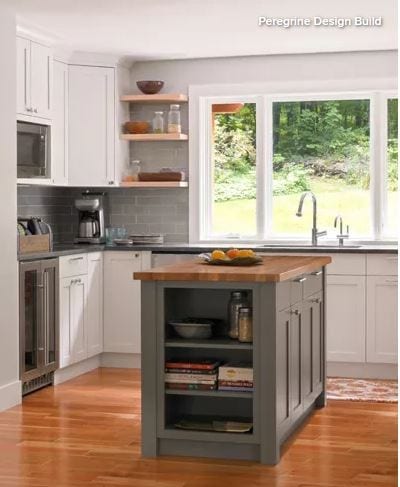
Other special features. 3-by-9-inch glass tile backsplash. Jet Mist granite countertops. Custom wine fridge. Hidden phone and computer charger in drawer. 

Designer secret. “We were excited to use mixed finishes in this project,” Deetjen says. “The island butcher-block counter plays off of the wood in the open shelving and wood counter at the eat-in dining area. Industrial touches are complemented by the warm cherry floors, and even the client’s rustic pottery collection is at home on the dark granite counters.”

Cabinet paint: White Wisp, Benjamin Moore; project photos: Susan Teare

Wood and White Brighten This Kitchen

Article by: Monica Banks

Kitchen at a Glance
Who lives here: A couple with two children
Location: Rosemont neighborhood of Montreal
Size: 210 square feet (19.5 square meters)

After living in their 1945 home for a few years, the owners decided it was time to expand their 155-square-foot kitchen, which lacked sufficient storage and felt cluttered. Originally, the home was designed in the typical Montreal fashion, with one corridor that has separate rooms branching off from the axis. The homeowners wanted not only to have more space, but also to give that space an open-concept feel.


White_Wood_Kitchen_2.JPG

Before. In this snapshot taken before the remodel, the existing kitchen had an eclectic look; the homeowners wanted to give it a cleaner, more minimalist design style.


White_Wood_Kitchen_3.JPG

Before. The kitchen also felt a bit closed in, thanks to the side walls surrounding the entry opening into the space.


White_Wood_Kitchen_4.JPG

Kitchen (After)

Layout. Removing those side walls and opening up the kitchen to the adjacent dining area created more breathing room and brought in more light. The right side of the room is composed of wall cabinetry that gives the family plenty of storage space. The kitchen is now 210 square feet. 

Style. Though the kitchen has a simple palette of primarily wood and white, the space feels dynamic thanks to variation in the textures and shapes — from the subway backsplash and the hexagon floor tiles to the beadwork on the upper cabinets and even the horizontal lines marked by the open shelving.

Floor. The homeowners kept the existing cherry floor but had it sanded and refinished.


White_Wood_Kitchen_5.JPG

This photo shows the left side of the kitchen (when viewed from the dining room). On the floor in front of the sink, the homeowners added a strip of hexagon tile for visual interest. 


White_Wood_Kitchen_6.JPG

Backsplash. Simple white ceramic subway tile gives the room subtle detailing that supports the kitchen’s clean, modern look. 


Island. The island countertop is covered with multiple tile pieces (see first photo in this story) that echo the subway tile pattern. 

Cabinets. A two-tone cabinet scheme contributes to the kitchen’s contemporary feel. The majority of the cabinetry and hardware is from Ikea, but the wood doors were handmade by a local artisan. 


White_Wood_Kitchen_8.JPG

Niche. The cabinetry wall on the right side of the kitchen is broken up by a central nook that the designers finished in herringbone tile. 

8 Elements of Classic Kitchen Style

By: Rebekah Zaveloff

Many people are at a loss when it comes to defining their style. Some people know what they like but are afraid of getting the terms wrong, or they’re afraid of being pigeon-holed into one style when they feel like they’re in between a few different ones. The truth is, most spaces have elements of different styles and aren’t all one way. 

To sort all this out, join me on a tour of kitchen styles and sub-styles, from Classic to Modern, Industrial to Cottage, and lots in between. Today we’ll start with the most approachable of styles, classic style. 

Read more

Smart Investments in Kitchen Cabinetry — a Realtor’s Advice

By Tiffany Carboni

The kitchen is the most expensive room in the house to build. The national average cost of a kitchen remodel is $50,000, though the real cost can vary widely, depending on where you live, the scope of the project and the materials you choose. New cabinetry can take up much of that expense. Make the most of this big purchase by treating your new cabinets as an investment. 

Realtor Victoria Gangi offers insider tips on how to get the best return on your cabinet investment, even if you’re not moving in the foreseeable future.

Read more

Silestone Expands Eternal Collection Designs


silestonecolors.JPG

Silestone has expanded its luminary collection with the introduction of five new colors. The new hues offer a modern, reinvented take on some of the most sought-after marbles and stones, coupled with the latest technological advancements from Silestone. The Eternal Collection is the first in Silestone’s offering to have veining and highlights run completely through the material, including its edges, resulting in an even more natural appearance. The five new colors, which bring the collection to a total of 10 colorways, include Eternal Bianco Calacatta, Eternal Classic Calacatta, Eternal Desert Silver, Eternal Emperador and Eternal Marfil.

The beauty of the material is met with industry-leading performance, thanks to its Silestone N-Boost technology. This innovation patented by Cosentino modifies the material’s surface at a molecular level to further enhance its outstanding technical and aesthetic attributes: Greater color saturation and extraordinary luster, along with an enhanced water repellent property that reportedly makes it even easier to clean and maintain. As with all Silestone natural quartz products, the Eternal Collection includes high resistance to impact and scratching; is manufactured in large formats; and offers versatility of application.

Eternal Bianco Calacatta: The luminary hue of the 2018 collection combines thick, electric veins with a soft gray background for drama and contrast, creating an instant focal point in any space. Eternal Calacatta Classic: Elegant and subtle, Eternal Calacatta Classic reinterprets coveted Calacatta marble. Its uniform grayish veins stretch across the slab with a translucent appearance, evoking an authentic resemblance to real stone.

Eternal Desert Silver: More monochromatic in its appearance, Eternal Desert Silver offers an icy, translucent aesthetic creased by fine, clear veins. Inspired by the classic and long-lasting marble trend, it complements any type of material and architectural element.
Eternal Emperador: A warm, tobacco brown background set against light and streaks embraces earthy tones reflective of a growing demand for moody, darker marbles.
Eternal Marfil: Creamy, soft and minimalist, Eternal Marfil puts a unique spin on Crema Marfil marble to bring an organic serene aesthetic to the space.

10 Storage Solutions for Kitchens With Character

Article by: Joanna Simmons

Kitchens are all about storage, but it can become rather predictable: Think rows of built-in cupboards and wall cabinets, with an emphasis on practicality over personality. So how can your cooking space ingeniously accommodate everything you need while also looking original and exciting? These 10 great solutions offer some fresh ideas — not to mention storage eye-candy!


Cabinet Storage Solutions 1

Go full-size. Pantries are huge news in kitchen storage and for good reason. While a conventional base unit requires you to get down on your knees with a flashlight to find that last can of beans, anything stored in a tall pantry like this one is easily visible and accessible. 

Typically fitted with drawers, racks, baskets and even lighting — and performing valiantly even when ultra-slender — these modern beauties offer plenty to love.


Cabinet Storage Solutions 2

Create an island library. Passionate home chefs accumulate lots of cookbooks over the years, but not always the space to store them. Volumes kept near the stove can become scruffy and grease-spattered and perhaps don’t merit being displayed prominently. 

How about this, though: neat shelves on the end of an island? The books are visible — and add color — without being central to the design of the kitchen, and they’re easy to grab when you’re searching for a recipe.


Cabinet Storage Solutions 3

Scale up. A pantry that’s also a breakfast station is sure to set any storage fanatic’s pulse racing. This is perhaps the ultimate piece of kitchen furniture, one most of us can only dream about. 

It combines oodles of storage with a dedicated space where you can prepare your coffee and toast. You can then stand and gaze at your neatly arranged shelves while you eat. Life doesn’t get much better than that, does it?

Repurpose a hanger. Dish towels go on a cupboard or oven door handle, right? Wrong. You can hang them on a hanger that is hanging on the wall! Original, quirky, inexpensive storage.


Cabinet Storage Solutions 5

Carve out space for the unwieldy. Chopping boards and trays are sizable, often heavy pieces that benefit from a dedicated home like this compartment incorporated into a run of cabinets. It’s such a simple little storage detail, but so invaluable.


Cabinet Storage Solutions 6

Ditch convention. This pale and unpretentious kitchen may not be to a neat freak’s taste, but there’s something to be admired in its anything-goes approach to storage. 

Superficially cluttered though it may appear, I suspect its owner knows exactly where everything is and that all the essentials are within a quick grab from the stove.

Opt for a lovely long shelf. There’s a growing trend for long shelves that simply break up a run of units rather than provide workaday storage. They can become home to beautiful objects or the odd cookbook or plant, helping to personalize a built-in design and lighten its look.


StorageSolution8.JPG

Hang it high. Making use of vertical space is a smart move in a kitchen, where storage often has to be worked into a small footprint. This space features a metal rack that was probably never intended for a kitchen but works beautifully holding pans and utensils. 

It’s attached high on the wall to reduce the risk of banging a head against a frying pan!

Resist the sleek. Kitchen design often tends toward the sleek and efficient, but it can also rock a more edgy, homemade look while still packing in tons of practical storage. So think laterally and use old piping and boards to make some shelving — you’ll get storage and original style at the same time.

Add a twist to the typical.Kitchen storage needs to be well-designed and abundant enough to hold everything from mugs to marmalade. But really great kitchen storage does it while adding a twist of unique style. 

These glass-fronted cupboards are fairly basic, but the tiling on the interior adds detail and interest and contributes to the kitchen’s industrial feel.

10 Things to Consider Before Remodeling Your Bathroom

Article by:  Gillian Lazanik, Houzz

Whether you have a simple powder room or a master en suite, functionality should be at the heart of your bathroom remodel. Read on to learn tricks for gaining storage, improving lighting and drainage, and more to ensure that your renovated bathroom stands the test of time.

Read more