FREE DESIGNS AND ESTIMATES

Silestone Expands Eternal Collection Designs


silestonecolors.JPG

Silestone has expanded its luminary collection with the introduction of five new colors. The new hues offer a modern, reinvented take on some of the most sought-after marbles and stones, coupled with the latest technological advancements from Silestone. The Eternal Collection is the first in Silestone’s offering to have veining and highlights run completely through the material, including its edges, resulting in an even more natural appearance. The five new colors, which bring the collection to a total of 10 colorways, include Eternal Bianco Calacatta, Eternal Classic Calacatta, Eternal Desert Silver, Eternal Emperador and Eternal Marfil.

The beauty of the material is met with industry-leading performance, thanks to its Silestone N-Boost technology. This innovation patented by Cosentino modifies the material’s surface at a molecular level to further enhance its outstanding technical and aesthetic attributes: Greater color saturation and extraordinary luster, along with an enhanced water repellent property that reportedly makes it even easier to clean and maintain. As with all Silestone natural quartz products, the Eternal Collection includes high resistance to impact and scratching; is manufactured in large formats; and offers versatility of application.

Eternal Bianco Calacatta: The luminary hue of the 2018 collection combines thick, electric veins with a soft gray background for drama and contrast, creating an instant focal point in any space. Eternal Calacatta Classic: Elegant and subtle, Eternal Calacatta Classic reinterprets coveted Calacatta marble. Its uniform grayish veins stretch across the slab with a translucent appearance, evoking an authentic resemblance to real stone.

Eternal Desert Silver: More monochromatic in its appearance, Eternal Desert Silver offers an icy, translucent aesthetic creased by fine, clear veins. Inspired by the classic and long-lasting marble trend, it complements any type of material and architectural element.
Eternal Emperador: A warm, tobacco brown background set against light and streaks embraces earthy tones reflective of a growing demand for moody, darker marbles.
Eternal Marfil: Creamy, soft and minimalist, Eternal Marfil puts a unique spin on Crema Marfil marble to bring an organic serene aesthetic to the space.

10 Storage Solutions for Kitchens With Character

Article by: Joanna Simmons

Kitchens are all about storage, but it can become rather predictable: Think rows of built-in cupboards and wall cabinets, with an emphasis on practicality over personality. So how can your cooking space ingeniously accommodate everything you need while also looking original and exciting? These 10 great solutions offer some fresh ideas — not to mention storage eye-candy!


Cabinet Storage Solutions 1

Go full-size. Pantries are huge news in kitchen storage and for good reason. While a conventional base unit requires you to get down on your knees with a flashlight to find that last can of beans, anything stored in a tall pantry like this one is easily visible and accessible. 

Typically fitted with drawers, racks, baskets and even lighting — and performing valiantly even when ultra-slender — these modern beauties offer plenty to love.


Cabinet Storage Solutions 2

Create an island library. Passionate home chefs accumulate lots of cookbooks over the years, but not always the space to store them. Volumes kept near the stove can become scruffy and grease-spattered and perhaps don’t merit being displayed prominently. 

How about this, though: neat shelves on the end of an island? The books are visible — and add color — without being central to the design of the kitchen, and they’re easy to grab when you’re searching for a recipe.


Cabinet Storage Solutions 3

Scale up. A pantry that’s also a breakfast station is sure to set any storage fanatic’s pulse racing. This is perhaps the ultimate piece of kitchen furniture, one most of us can only dream about. 

It combines oodles of storage with a dedicated space where you can prepare your coffee and toast. You can then stand and gaze at your neatly arranged shelves while you eat. Life doesn’t get much better than that, does it?

Repurpose a hanger. Dish towels go on a cupboard or oven door handle, right? Wrong. You can hang them on a hanger that is hanging on the wall! Original, quirky, inexpensive storage.


Cabinet Storage Solutions 5

Carve out space for the unwieldy. Chopping boards and trays are sizable, often heavy pieces that benefit from a dedicated home like this compartment incorporated into a run of cabinets. It’s such a simple little storage detail, but so invaluable.


Cabinet Storage Solutions 6

Ditch convention. This pale and unpretentious kitchen may not be to a neat freak’s taste, but there’s something to be admired in its anything-goes approach to storage. 

Superficially cluttered though it may appear, I suspect its owner knows exactly where everything is and that all the essentials are within a quick grab from the stove.

Opt for a lovely long shelf. There’s a growing trend for long shelves that simply break up a run of units rather than provide workaday storage. They can become home to beautiful objects or the odd cookbook or plant, helping to personalize a built-in design and lighten its look.


StorageSolution8.JPG

Hang it high. Making use of vertical space is a smart move in a kitchen, where storage often has to be worked into a small footprint. This space features a metal rack that was probably never intended for a kitchen but works beautifully holding pans and utensils. 

It’s attached high on the wall to reduce the risk of banging a head against a frying pan!

Resist the sleek. Kitchen design often tends toward the sleek and efficient, but it can also rock a more edgy, homemade look while still packing in tons of practical storage. So think laterally and use old piping and boards to make some shelving — you’ll get storage and original style at the same time.

Add a twist to the typical.Kitchen storage needs to be well-designed and abundant enough to hold everything from mugs to marmalade. But really great kitchen storage does it while adding a twist of unique style. 

These glass-fronted cupboards are fairly basic, but the tiling on the interior adds detail and interest and contributes to the kitchen’s industrial feel.

10 Things to Consider Before Remodeling Your Bathroom

Article by:  Gillian Lazanik, Houzz

Whether you have a simple powder room or a master en suite, functionality should be at the heart of your bathroom remodel. Read on to learn tricks for gaining storage, improving lighting and drainage, and more to ensure that your renovated bathroom stands the test of time.

Read more

10 Tips for Planning a Galley Kitchen

Article by: Graeme Wilson

A galley kitchen consists of two parallel runs of units forming a central corridor in which to work. The galley layout works well for all kitchen styles; it’s also the preferred design of many professional chefs, who love it because it enhances safety and efficiency during cooking. Just like the compact galley on ships, for which the layout is named, galley designs optimize space by packing in an abundance of storage and work area, making them ideal for small kitchens. If you’re considering a galley layout or revamping one you have, here’s what you need to know.

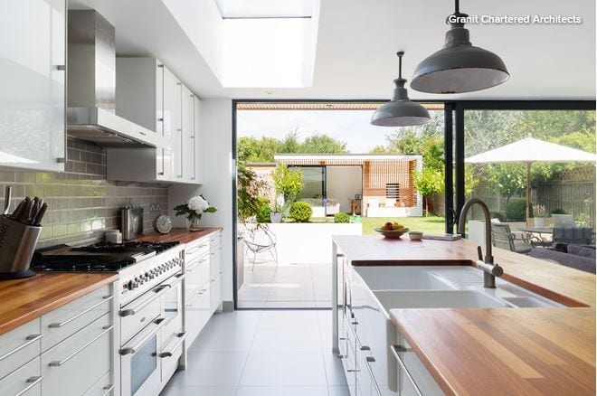
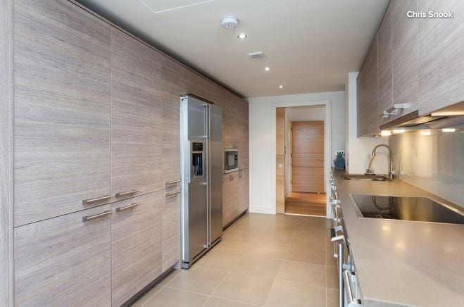
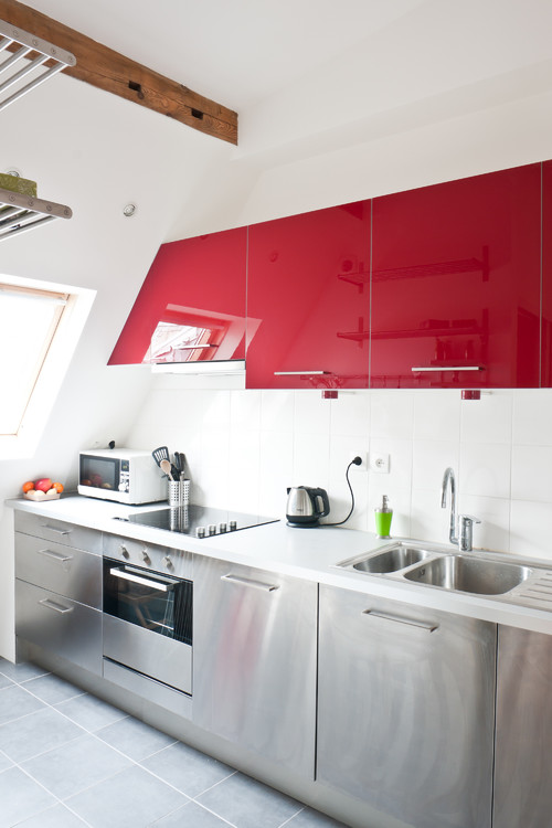
1. Assess your space. Though galley kitchens work best in small spaces, they can also be good for medium-sized kitchens, such as the one pictured here. However, be aware that if the opposing runs are too far apart, the kitchen will lose its efficiency. (This kitchen gets it right.) 

Also know that a galley layout, while ideal on a professional level, is usually an enclosed space without a dining area. That means that if there’s no possibility of opening up the space, it’s potentially not the most sociable of arrangements. On the other hand, a galley layout in an open-plan space can offer the best of both worlds. (Read on for details about galley kitchens with islands.) 

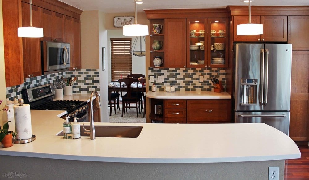
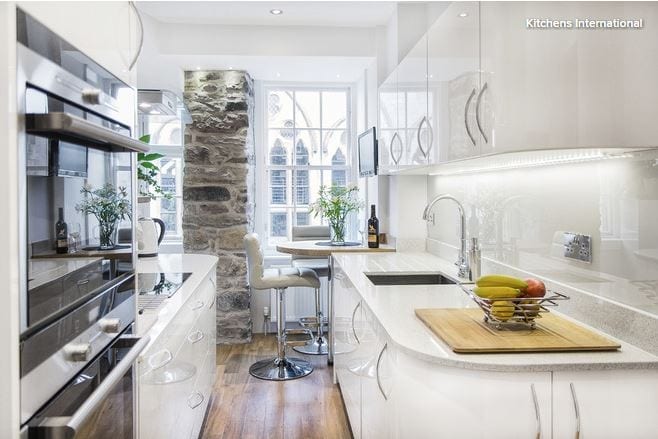
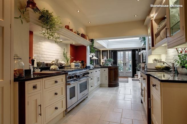
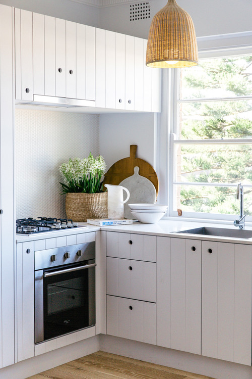
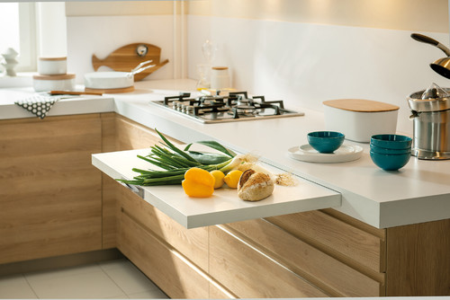
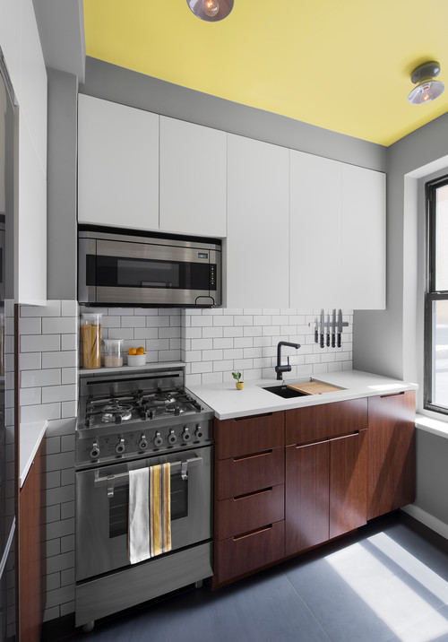
2. Choose your galley look: Symmetrical … When it comes to galley kitchens, there are two layout preferences. The first is relatively symmetrical, as seen here. This usually means the length of the runs and the arrangement of units on each side mirror each other as much as possible — or as much as you want.… or asymmetrical. You can opt for an asymmetrical layout instead, using various approaches. One involves focusing tall cabinets or a bank of appliances on one side of the room, with base and wall units on the other (as seen in the next image). Or you can go with a mix of tall and wall units along one side, with a single run of base units on the other if, for example, you have an open-plan space, as pictured here.

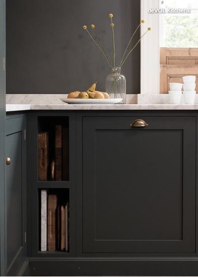
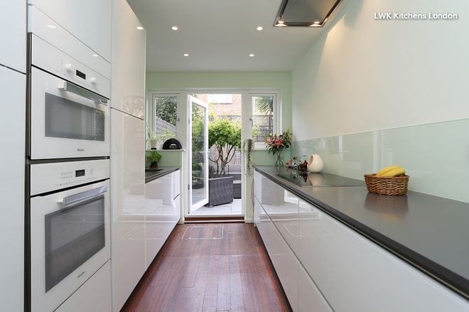
3. Put tall cabinets on one wall. If you’re designing a galley kitchen as described above, it’s preferable to go for a wall length of at least 12 feet so the sink and cooktop can be placed far enough away from each other. For safety, these should be at least a foot apart, but since that wouldn’t leave any work space, we always try to site them more than 3 feet apart. In this arrangement, a run of 12 feet allows for sufficient sink capacity, with cabinets or drawers beneath the range — occasionally adaptation is required for top drawers in this scenario — and it ensures that all the major appliances fit. 

Finally, 12 feet allows space for the units on the opposite run — the fridge, oven housing and pantry storage, for example. This arrangement provides ample storage space, helping keep the kitchen tidy and the countertops free of clutter.
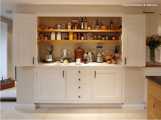
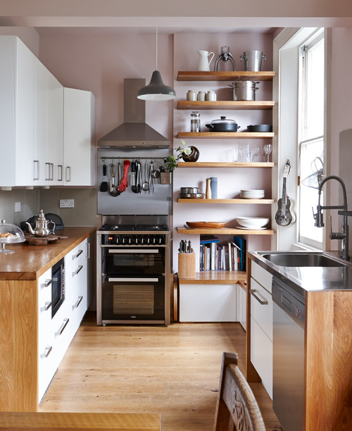
4. Or break up the runYou might prefer an asymmetrical layout with tall and base units along the same wall. For example, if a wall is just over 12 feet long, it’s likely to have three tall housings at one end and three base units at the other. Typically, there would be wall units, floating shelving or a window above the base units. Along the opposite side you could have wall units, shelving, a window or even a clear wall. 

This arrangement works really well if the kitchen is quite narrow, since without a tall bank of units as you enter the kitchen, the space will feel more open.

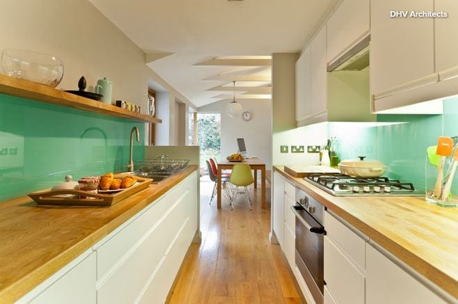
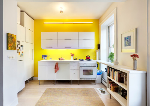
5. Work with a galley corridor.Depending on the layout of your home, galley kitchens may or may not be closed off at one end. If the far end leads to another room or the garden, it will see heavy traffic because it will become a thoroughfare.

Depending on the number of people in your household, this may not be a problem, but if you have small children or pets, you won’t want them charging through the kitchen while you’re holding a sharp knife or a pan of boiling water. 

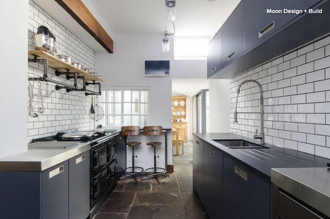
You can enhance the safety of your layout — particularly where the corridor is very narrow — by planning your kitchen with the sink and cooktop on the same run. Though less efficient than having those features opposite each other, this arrangement focuses your appliances in one area, so you won’t have to turn to the opposing run with potentially dangerous items in your hands.

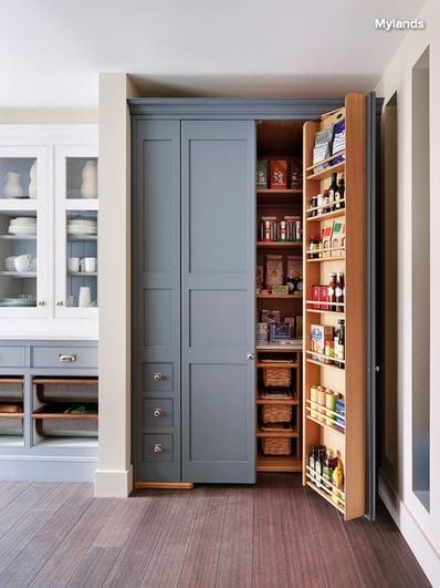
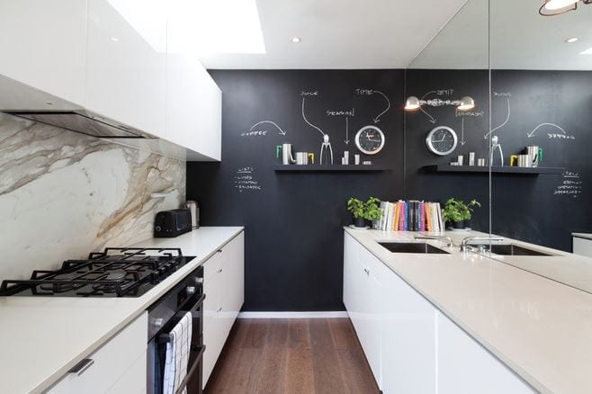
6. Enhance a closed-off kitchen wall. A galley kitchen closed off at one end can be a safer layout, because there’s only one entrance, giving the cook greater awareness of others coming and going. But how to make good use of this wall space? It might be there’s a window here, in which case it’s important not to block your kitchen’s natural light. Adding a stool would let you sit at the far end to write out shopping lists or chat on the phone. 

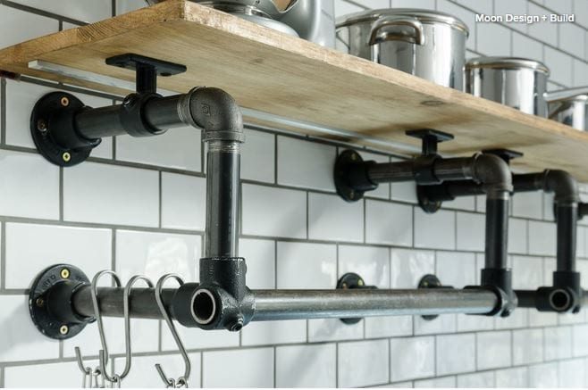
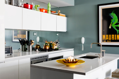
Alternatively, there might be room for some open shelving, a nice painting or perhaps a family-friendly chalkboard wall, as seen here, which can be used for playful drawings and notes or for shopping or to-do lists.

The clever use of the mirror in this compact kitchen is also worth noting; it creates the impression of a bigger space.

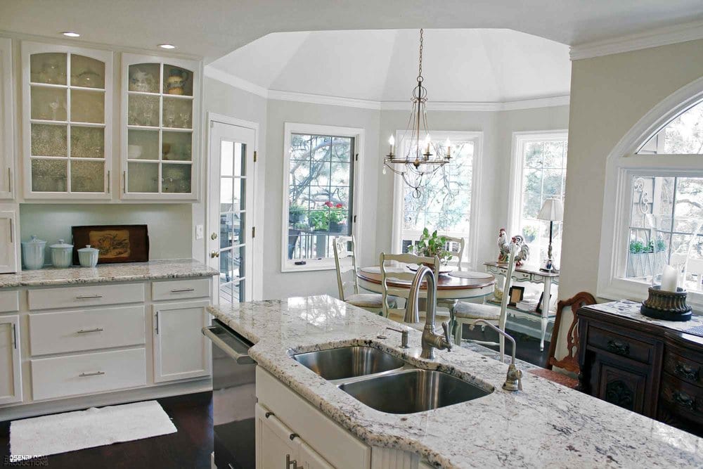
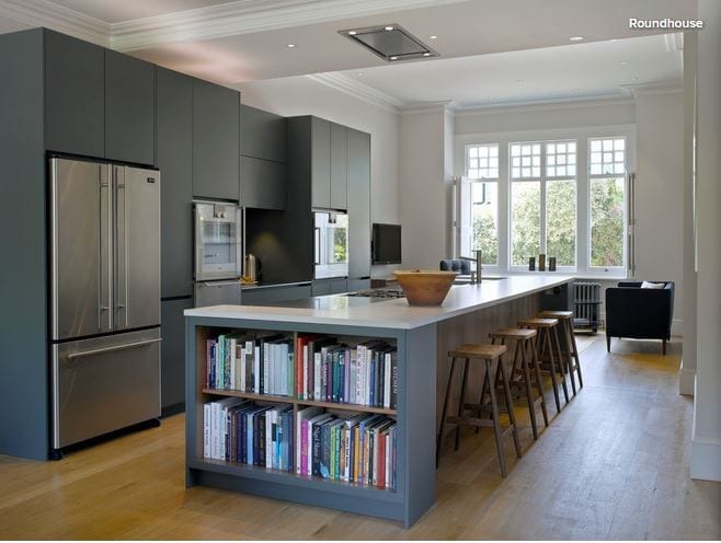
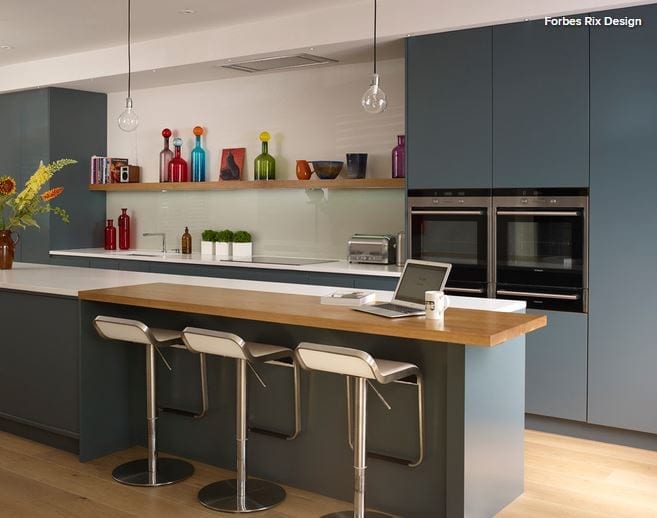
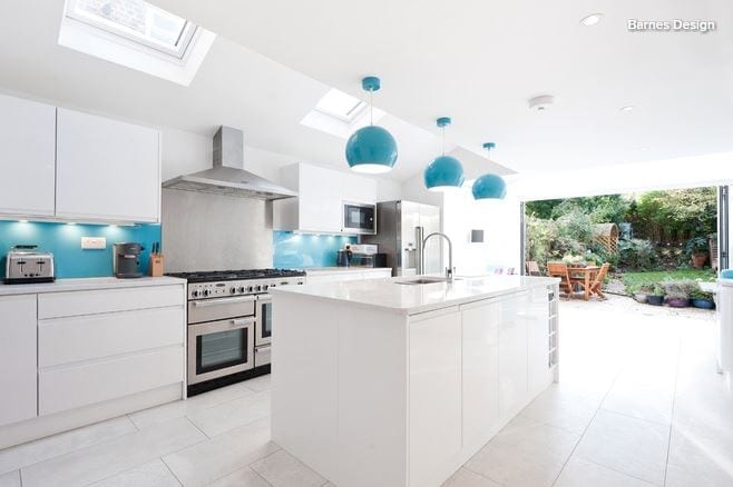
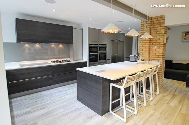
7. Create a galley with an island. I’ve mentioned that enclosed galley kitchens may not be the most sociable setting for the cook. A popular adaptation, when space allows, is the inclusion of an island. 

In this kitchen, the island replaces one of the runs to become part of the kitchen layout and functionality. It sits parallel to the longer run of units and typically houses either the range or the sink. Whichever of those is not positioned in the island would be staggered on the opposing run rather than directly opposite. This staggering is safer and more efficient during cooking, because it reduces the amount of turning required between the sink and stove.

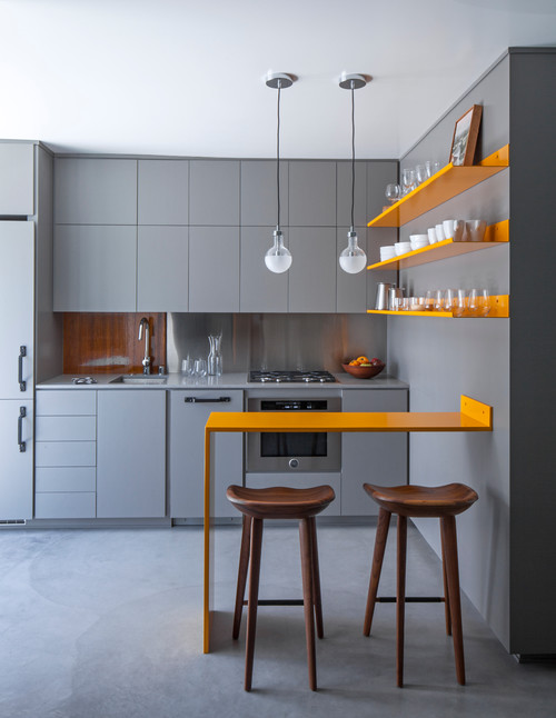
8. Make your galley sociable. Some homeowners want to add an island to a galley layout yet intend to keep the additional work surface clear. This is often the case with bakers, who like to use the space for rolling out pastry. 

This was part of the goal for the kitchen seen here, which was designed for a professional recipe developer who worked from home. Her kitchen also had to accommodate the needs of her husband and two young children, and the seating on the far side of the island helps with this, keeping the kids safely clear of the cooking area but ensuring a more sociable arrangement than a standard galley would have.

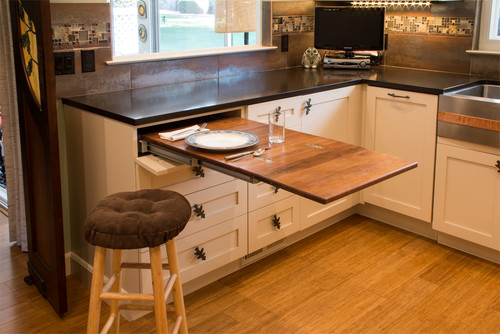
9. Add seating. Sometimes there’s space for a small peninsula or breakfast bar in a galley kitchen, providing additional storage as well as dining space. Here, the peninsula at the far end of the kitchen is fully clear of the cooking zone and has seating on the far side. (It also doubles as a butcher block.)

If there’s space to add a table between the opposing runs of your galley kitchen, this can sometimes work. However, you need to be careful when planning the space, because if it pushes your work surfaces too far apart, they’ll be much less efficient. 

Adding a small cart as an extra work surface might be an effective alternative, although in most cases there’s sufficient counter space in a galley to eliminate the need for this — unless it’s a specialized addition such as a butcher block.

10. Enhance a sense of space. When considering a galley layout, homeowners are keen to avoid a “corridor” effect, in which the kitchen feels small and enclosed. But even in small spaces, there are ways to avoid this. 

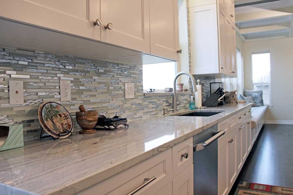
As already mentioned, losing the continuity of tall units in favor of wall units or shelving will help open up the space. The choice of furniture also helps: High-gloss finishes in pale colors are best for reflecting light and enhancing a sense of space. Similarly, doors and drawers without handles give a clean look and take up less physical space than handled ones. 

Finally, lighting is key. Well-placed and oversized lighting will soften the kitchen’s look and create the impression of more space.

CREATING ECO SUSTAINABILITY IN COUNTERTOP FABRICATION

Granite Countertop in Denver Kitchen

When it comes to construction of any kind, environmental concerns are more important than ever. This is why The Top Shop Inc (AC&F) partnering with VT Industries, is committed to providing sustainable products and using environmentally friendly manufacturing methods.

Our production facility located in Denver, Colorado works hard to keep emissions and waste to a minimum, conserve natural resources, and protect local ecosystems. This strategically located facility, allows The Top Shop Inc. (AC&F) to provide the shortest lead times available but more importantly, reduce harmful vehicle emissions that contribute to air pollution and ozone depletion.

Every post form countertop we offer is GREENGUARD Indoor Air Quality Certified®. The Top Shop Inc. (AC&F) partnering with VT Industries, is the first and only laminate countertop product to receive this low-emitting certification, ensuring our product will contribute to healthy indoor air and building occupant wellness.

With EQcountertops, The Top Shop Inc. (AC&F) takes the sustainability of our countertops to the next level. Manufactured using 100% pre-consumer recycled particleboard, water-based adhesives and GREENGUARD Certified laminate, EQcountertops meet multiple green building standards, including Leadership in Energy and Environmental Design (LEED®) and NAHB’s green building guidelines.

Best of all at The Top Shop Inc. (AC&F), we’re continually adapting our manufacturing techniques and providing innovative products to ensure environmental responsibility. All employees—from production to accounting—are involved and encouraged to find innovative ways to make our business efficient and effective.

12 Genius Design Moves for Small Kitchens

Article by: Natasha Saroca

Is your kitchen lovely and large, or is it on the smaller side? If it falls into the latter group, I can sympathize. I spent the better part of last year living in a studio apartment with a single-wall kitchen that was a measly 32 square feet (3 square meters). However, it wasn’t the shortage of square footage that was the problem, but rather that the cooking zone wasn’t the smartest, most efficient or space-savviest of kitchen designs. (For instance, it had no usable work area, as the sink and cooktop took up pretty much all of the countertop space.)

Since I was only renting the apartment, I couldn’t renovate the area, but that didn’t stop me from mentally writing a list of improvements I’d make if given the chance. Here are some of the design tricks I would have used to transform the spatially challenged kitchen into a cooking zone that was big on functionality, space-maximizing solutions and visual appeal, and that offered the illusion of spaciousness, too. Borrow these ideas when tackling your own cramped-kitchen makeover or, if you’ve successfully revamped a compact cooking zone for the better, share your must-try design moves in the Comments section.

1. Add a mirrored backsplash. A strategically placed mirror works wonders when it comes to creating the illusion of spaciousness in a cramped room, as it will bounce light around and help visually elongate the walls. An easy way to introduce this reflective surface into a small kitchen is by way of a mirrored backsplash — a sneaky and extremely effective design trick used in this compact cooking zone.

2. Be open to open shelving. While not everyone is a fan of open shelving, there’s no denying it’s a smart storage solution for rooms with a modest footprint. Not only do open shelves deliver an airy, open and bulk-free look — unlike cabinets with solid doors, which can look visually heavy in a small space — but they also ensure that kitchen essentials are easily accessible, too. Hanging storage, another functional and space-maximizing solution spotted in this cooking zone, achieves a similar effect.

If you’re eager to incorporate open shelving, just be mindful that the shelves will require a little extra upkeep to ensure that they and their contents remain dust free.

3. Opt for an all-white palette. Choosing an all-white color scheme will make your compact kitchen look light, airy and more spacious than it is in reality. If an all-white palette isn’t up your decorating alley, or you desire a scheme that offers more visual drama, opt for white walls or overhead cabinets, and try base cupboards made from wood or dressed in a dark, dramatic tone. Using white up top will enlarge the space visually, while the darker tone down below will anchor the room without making it feel closed in.

Alternatively, you might like to consider a soft neutral or pastel palette. Barely-there hues such as powder blue, mint, cream or dove gray are ideal for use in small spaces, as they add a hint of color and interest without being too overwhelming or heavy like bolder, more saturated tones, which can weigh down a compact room.

4. Fill your space with light. Flooding your room with natural light will go a long way toward making a small area look more spacious. However, if you’re restricted when it comes to window placement and size, the next best thing is to come up with a lighting plan that will brighten up and help visually enlarge your space, while transforming it into a more functional work zone, too.

This airy, cheerful kitchen is lucky enough to boast four different light sources: a generously sized window, which allows an abundance of natural light to filter into the room; a ceiling light that provides ambient lighting; a long wall-mounted fixture that illuminates the area from above and draws attention to the sunny feature wall that it’s affixed to; and undercabinet lights that ensure the countertop is well lit and showcase the suspended style of the overhead cabinets, which adds to the room’s sense of spaciousness.

5. Create the illusion of space with horizontal and vertical lines. This striking kitchen is a study in how to enlarge a space visually by introducing vertical and horizontal lines. As you can see looking at the striped cupboard doors and panels in this compact cooking zone, vertical lines draw the eye upward and add height to a small room, while horizontal lines add depth and make narrow spaces appear wider and roomier.

6. Incorporate space-savvy storage. A shortage in storage is a problem usually associated with small kitchens. However, this obstacle can be overcome by incorporating clever, space-maximizing storage solutions in your cooking zone — think corner drawers, appliance garages, pullout vertical pantries, drawer organizers and corner systems. Doing so will ensure that everything has a place to call home in your kitchen, cutting unnecessary clutter and visual bulk and making the area more effective to work in.

7. Go with glossy finishes. High-shine surfaces, such as stainless steel, two-pack polyurethane and ceramic tiles, will not only inject your kitchen with interest and sleek sophistication, but will amplify the natural and artificial light in the room, making the area appear more spacious.

8. Choose a countertop that works double time. Since space is at a premium in small cooking areas, it’s important that every surface, material and design element earns its keep, even your kitchen countertop. While countertops have a practical purpose — as food prep surfaces and general workspace — they can also double as a space to stash kitchenware (such as the crafty pullout chopping board pictured here), which will help keep your counter and cupboards free of physical and visual clutter. Other space-saving, cleverly concealed countertop accessories you might like to consider include a built-in utensil holder, condiments organizer, knife block or bread box, each of which sits flush with the top of the counter.

9. Choose glass-front doors. Like open shelving, glass-front cupboards trick the eye into thinking a compact kitchen is more generous in size, but with the benefit of keeping the contents of your cupboards free from dust and cooking splatter. Just remember to keep things nice and orderly inside for a clean, clutter-free look.

Another perk of decking out your cooking zone with glass cabinet doors is that you can easily see what items are stashed inside your cabinets and when you’re running low on pantry items, resulting in a more efficient space to work in.

10. Fit in a cleverly concealed table for casual eats. Don’t have room for a breakfast bar or dining table in your kitchen? Take design cues from this crafty space and incorporate a foldable table that can be tucked out of sight when not in use. The geometric chairs slide into the nook below, so as to not take up precious floor space and to enhance the room’s clean, seamless look.

Another space-savvy solution is to equip your countertop with a pullout table, like the one shown above.

11. Stick with clean, slender lines. Resist the urge to decorate your compact kitchen with fussy design elements and decor that will crowd it and add unnecessary visual bulk. Instead, stick with features with clean, simple lines that are visually lightweight and don’t consume too much floor space. 

This design trick takes shape in several ways in this small yet stylish kitchen. Note the slim breakfast bar, floating shelves and leggy bar stools; the use of finger pulls instead of bulky handles; and the simple industrial-style exposed bulbs, which draw the eye up to the ceiling, adding to the illusion of space.

12. Master the art of distraction. A high-impact feature wall not only will inject visual drama into a compact kitchen, but will also add depth and draw the eye down the length of the room, making it appear longer and more open. This contemporary kitchen proves just how successful this design trick can be when done right.

Likewise, a statement ceiling will also amplify the height of a kitchen that has diminutive dimensions, while doubling as a showstopping focal point. Take design cues from this compact cooking zone and paint your ceiling a bright hue (steer clear of moody colors, like black and dark gray, which will visually lower the roof and make the room appear more intimate). Alternatively, you might like to lift the look of your ceiling with wallpaper or a mirrored surface, or try a recessed ceiling with LED lighting.

[See more from Natasha Saroca on Houzz.]